

"Order, peace of mind, and confidence."
A brand identity built from the ground up for a Sherwood Park law firm that had never had one — logo, guidelines, and a complete print system.

When we first met the lawyers at Nigro Manucci in Sherwood Park, it was quickly surmised that we were starting at the ground level of their brand identity. They had no concept of what their brand was or how to best represent it.
We stepped in and held meetings with them to discover who they were, what they represented, and how they wanted to best articulate that message. The conversation began by identifying colours that inspired them.
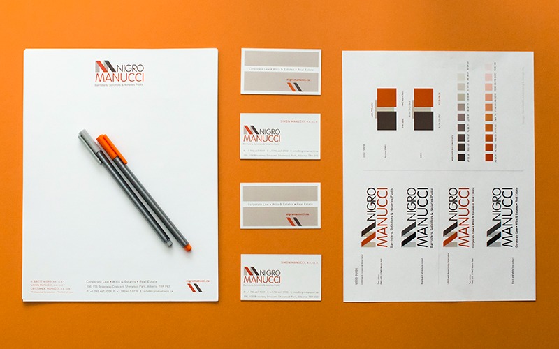
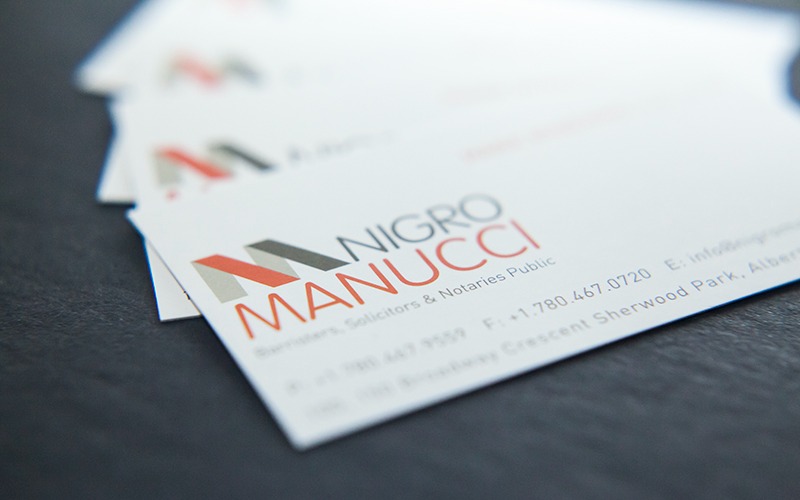
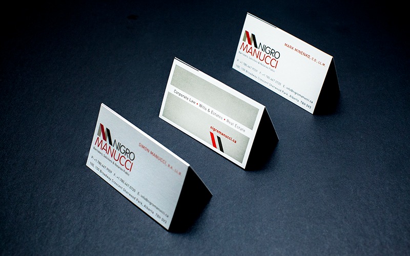
We developed the first draft of the logo using a few colour schemes — the complementary orange and brown colours you see in their existing logo were always the front-runner. From there we developed the brand guidelines, which led to taglines, font choices, and tone of the copy for the web. We also implemented and printed their complete identity system, including business cards and letterhead.
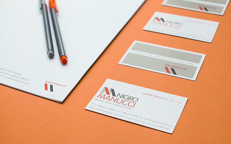
We poured a lot of effort into creating a strongly cohesive brand that will work for Nigro Manucci into the foreseeable future — which has resulted in them coming back to us for all their marketing requirements.

Let's talk about how a strong, cohesive brand identity could work for your business too.
Contact Us